HONGLIBAG

Pantone colors are often used in graphic design and printing projects to ensure that colors are consistent and accurately reproduced. When selecting Pantone colors for your project, it is important to consider the different types of ink that will be used. In this post, we'll give you five tips for using Pantone colors in your next project
What is pantone?
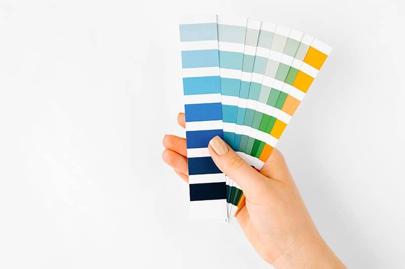
Pantone, or Pantone Matching System (PMS), is a standardized color reproduction system that is used in a variety of industries, including printing, fashion, and product design. The Pantone system includes both spot colors and process colors. Spot colors are specific, predetermined colors that can be printed using a single ink color. Process colors are created by printing a combination of four color inks (cyan, magenta, yellow, and black) in various proportions.
What is pantone used for?
Pantone colors are often used in graphic design and printing projects to ensure that colors are consistent and accurately reproduced. When selecting Pantone colors for your project, it is important to consider the different types of ink that will be used. For example, some inks are more vibrant than others, so you may want to choose a color that will pop off the page. Additionally, some inks are better suited for certain types of paper, so you'll want to make sure that the ink you choose will work well with the paper you're using.
Pantone color finder
There are a few different ways to find the perfect color and add it to the color palette for your project. The easiest way is to use a Pantone color finder, which is a tool that allows you to visually identify Pantone colors. Alternatively, you can use a Pantone formula guide, which lists the various ink formulas used to create each Pantone color.
Pantone color chart
Once you've selected a few potential colors, it's time to create a Pantone color chart. This will help you compare the colors side-by-side and decide which one is best for your project. To create a Pantone color chart, start by printing out a blank piece of paper. Then, use different types of ink to print out each of the colors you're considering. Finally, cut out each color swatch and tape them to the paper so you can see how they look next to each other.

Pantone color bridge
The Pantone color bridge is a great tool for comparing Pantone spot colors to their closest CMYK equivalent. This is helpful if you're working with a printer who only uses CMYK inks. To use the color bridge, simply find the Pantone color you want to use and look up its CMYK equivalent.
.
Leave A Message
If you are interested in our products and want to know more details, please leave a message here, we will reply you as soon as we can.